The Exploration tab is the second tab in the interface of Simulx. It simulates a typical individual to explore a model by interactively changing treatments and model parameters.
- Simulate a single individual
- Compare treatments using exploration groups
- Display any non-random model variable as prediction output
- Interactivity: impact of parameters and dosing regimen on the model dynamics
- Define new parameter or treatment elements
- Add observed data in the plot
- Select elements for Simulation of clinical trials
- Plots settings
- Export the plots as images
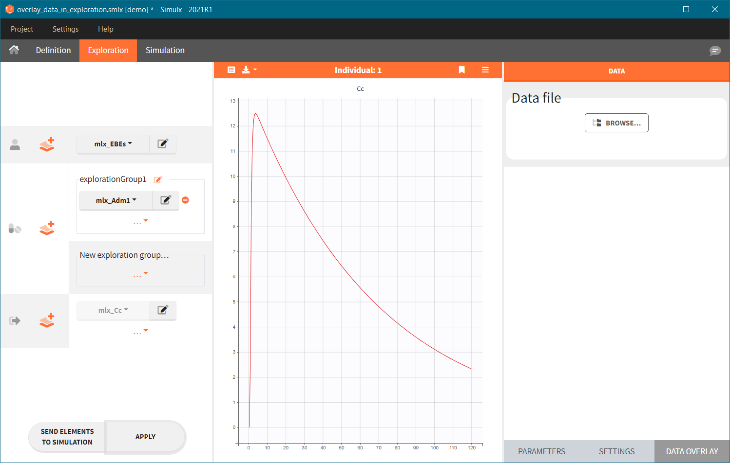
Predicted individual
In Exploration, the predictions are based on only:
- one set of individual parameters (mandatory),
- one or several treatments (optional) for one individual,
- one or several outputs (mandatory) with a single vector of measurement times per output,
- one set of regressor values, only if regressors are present in the model (mandatory).
These elements are selected in the left panel.
Thus an element of type “Individual parameters” must be selected, and it is not possible to select an element of type “Population parameters“.
If a selected element is a table containing several sets of individual values, then the first row in the table is selected by default, and the “ID” field on top of the plot in the middle allows to select the row in the table corresponding to a particular ID.
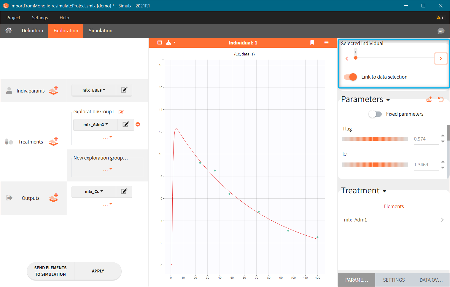
[Demo: 1.overview/importFromMonolix_resimulateProject.smlx]
This field is highlighted on the figure below, corresponding to a project that comes from a Monolix project imported into Simulx:
-
- the individual parameters come from the table mlx_EBEs contains the EBEs estimates,
- the treatment mlx_Adm1 contains the individual doses imported from the dataset used in Monolix,
- the output mlx_Cc contains a single vector of regular measurement times for Cc, the structural model output.
Thus changing the “ID” value will change the row read from the two tables mlx_EBEs and mlx_Adm1.
Exploration groups
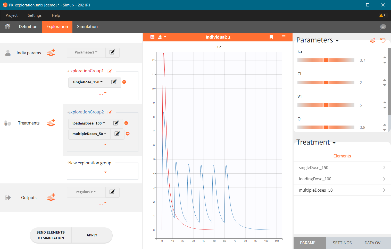
- 3.exploration/PK_exploration.smlx
Treatment can contain several elements in different exploration groups (explorationGroup1 and explorationGroup2 below), or combined within an exploration group (as in the explorationGroup2 below). Each exploration group produces a separate prediction. If an exploration group contains several treatments, then the prediction corresponds to the treatments given together to the same individual.
In the demo shown below, there are two exploration groups: the first corresponds to the treatment element singleDose_150, while the second corresponds to the combination of loadingDose_100 and multipleDoses_50. Two prediction curves in different colors represent these two exploration groups in the plot.
Exploration outputs
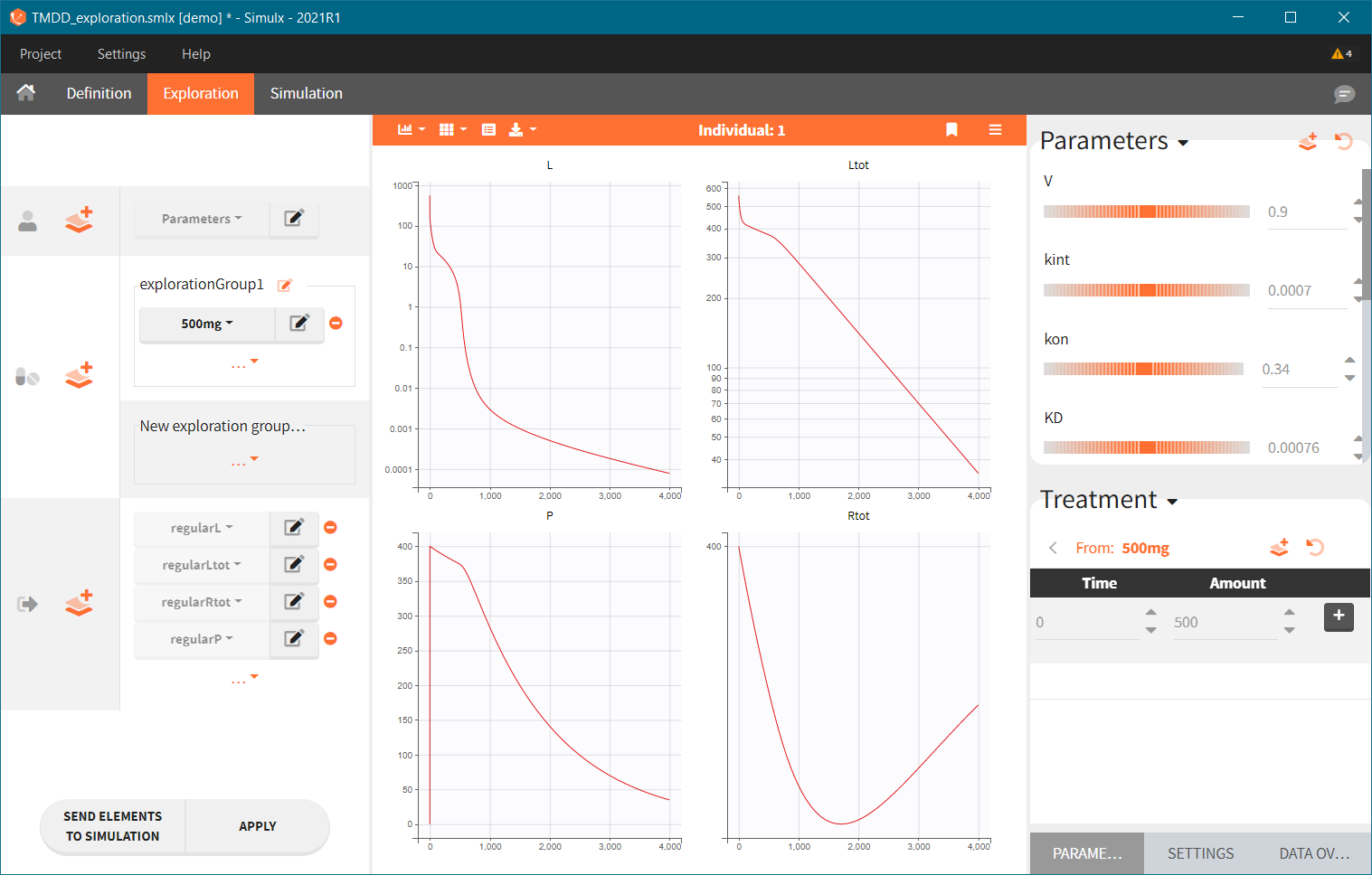
- 3.exploration/TMDD_exploration.smlx
Only non-random element of type “Output” can be selected in Exploration, thus they should:
-
- correspond to continuous variables (consequently excluding time-to-event, categorical or count variables)
- not include a residual error model in their definition.
By default, there is a separate plot for each selected output, as shown below. This can be changed in the exploration settings, where it is possible to select variables to display at each chart. If the scenario contains several output elements based on the same variable (but on a different grid), then they are plotted on the same plot with merged grids.
Interactive modification of parameter values or dosing regimen
- 3.exploration/PK_exploration.smlx
The right panel of the Exploration tab has three sub-tabs: PARAMETERS, SETTINGS and DATA OVERLAY. The parameter values and dosing regimens can be modified there to explore in real-time their impact on the model dynamics.
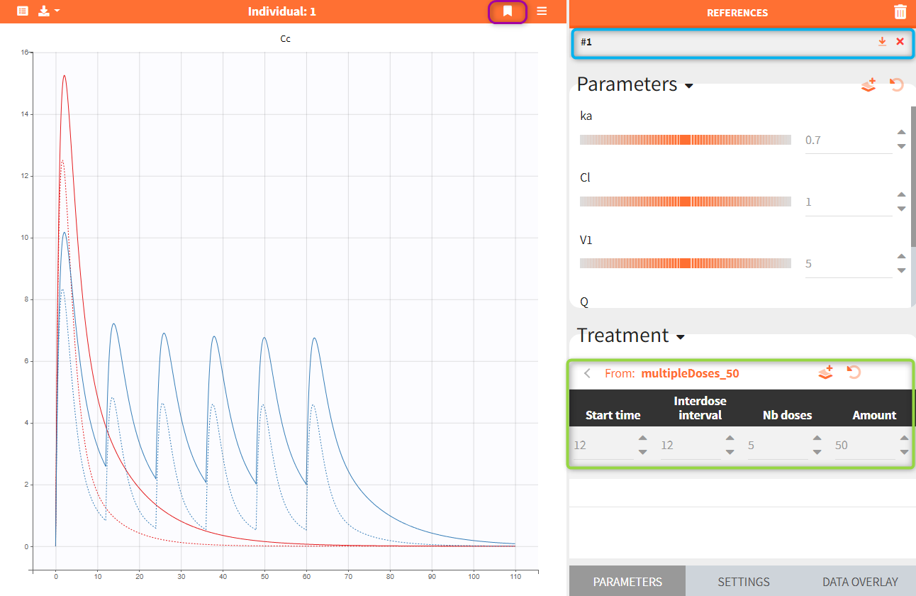
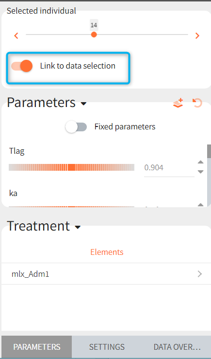
The figure below shows the PARAMETERS sub-tab with the model parameters (Parameters) and treatment parameters (Treatment) sections (highlighted in blue). The parameter values can be changed via the small arrows, sliders or by entering new values with the keyboard. The “reset” button ![]() resets parameters to their initial values, while the “new” button
resets parameters to their initial values, while the “new” button ![]() generates a new element (individual parameters element or treatment element) using the current values. On the plot, the solid curves correspond to the current predictions, while reference curves, added with the button
generates a new element (individual parameters element or treatment element) using the current values. On the plot, the solid curves correspond to the current predictions, while reference curves, added with the button ![]() , are shown as dashed lines.
, are shown as dashed lines.
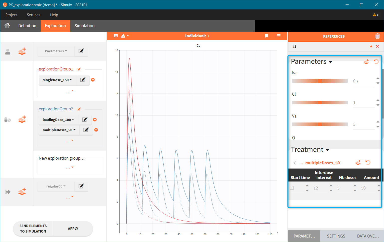
Reference curves. In the figure below, the section “Treatment” – highlighted in green – shows the elements from the treatment element: multipleDoses_50. All its parameters, such as start time, inter-dose interval, number of doses and dose amount can be modified. Current values can be set as a reference by clicking on the button ![]() – highlighted in purple. The reference curves are listed on the right panel – highlighter in blue – and are represented by dashed lines in the plot.
– highlighted in purple. The reference curves are listed on the right panel – highlighter in blue – and are represented by dashed lines in the plot.
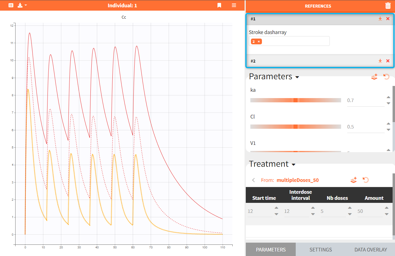
Several reference curves can be created and each successive one is displayed with a corresponding number. The icon ![]() restores the reference parameters values, and
restores the reference parameters values, and ![]() removes the reference curve from the list and from the plot. Hovering on a reference line (#1 in the figure below) highlights in yellow the corresponding reference curve, as seen in the figure below. Stroke dash-array defines the pattern of dashes and gaps of a curve.
removes the reference curve from the list and from the plot. Hovering on a reference line (#1 in the figure below) highlights in yellow the corresponding reference curve, as seen in the figure below. Stroke dash-array defines the pattern of dashes and gaps of a curve.
Defining new parameter or treatment elements
- 3.exploration/PK_exploration.smlx
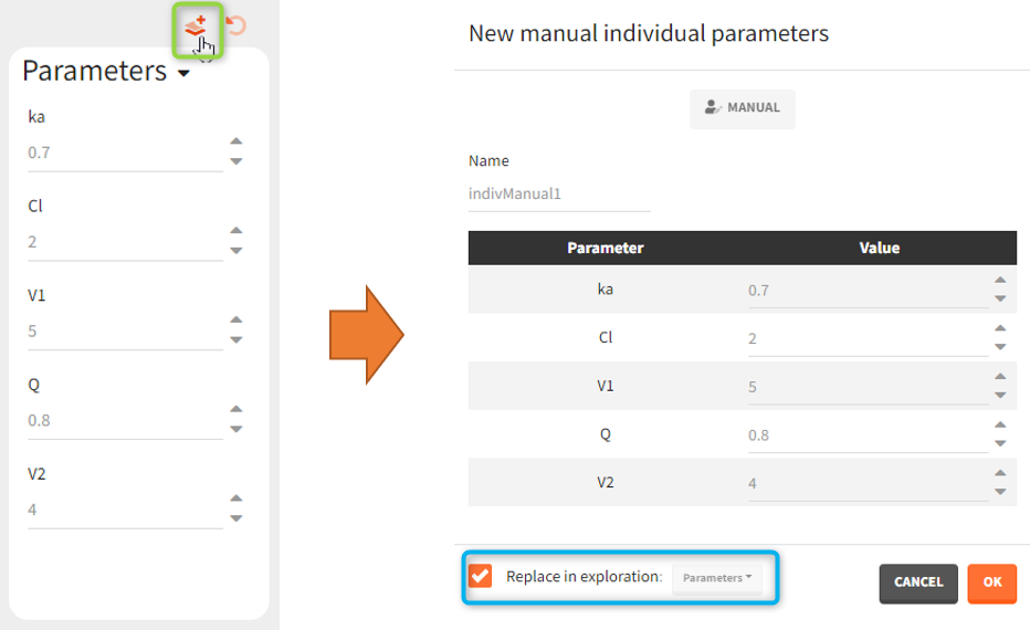
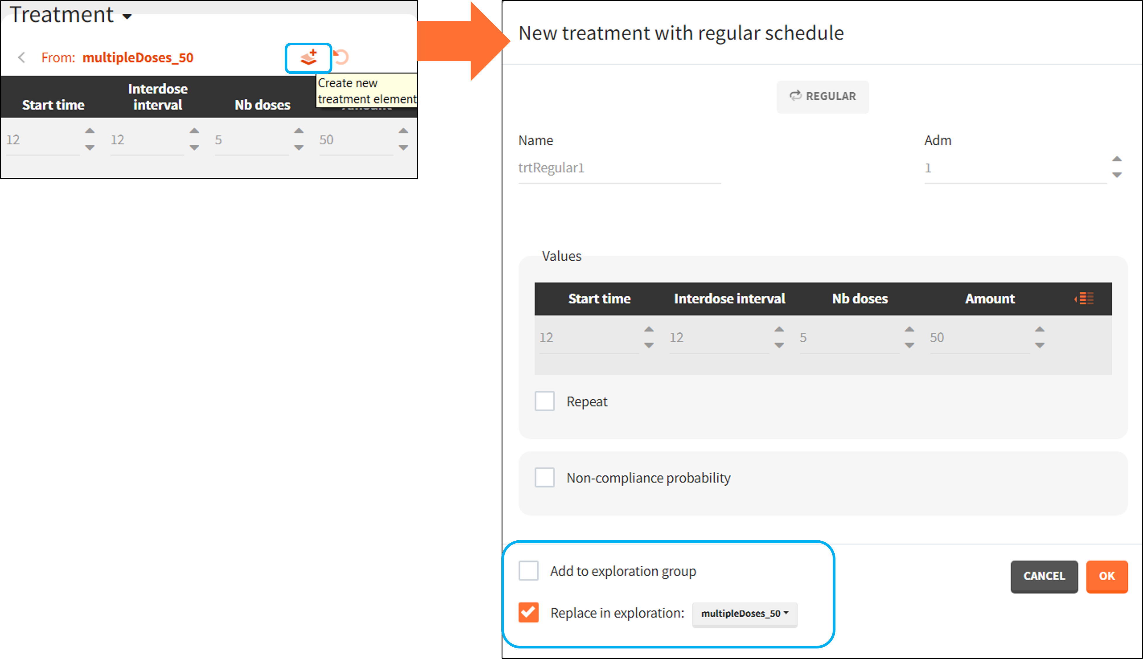
Exploration allows to create new elements from the current values by clicking on the icon ![]() . In the parameter section it creates the Individual parameters element, while in the treatment section it creates the Treatment element.
. In the parameter section it creates the Individual parameters element, while in the treatment section it creates the Treatment element.
A window to define a new element opens automatically. For the parameters, the individual parameter element is of type “manual” and by default replaces the previously selected element in the Exploration scenario. Untick the corresponding checkbox (blue mark in the figure below) to only define a new element – without the replacement.
A new treatment element can be set as a regular or manual type – depending on the definition in the exploration. By default it replaces the treatment element used in the exploration, but it can be also added as the new treatment to a new exploration group.
Overlay of the observed data
Continuous data can be overlaid on the prediction plots.
Load
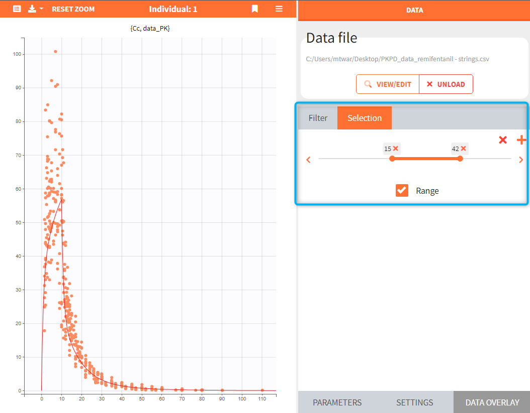
Data overlay sub-tab in the Exploration tab allows to load a data file. Click on the BROWSE button and select a file. It has to be a Monolix compatible dataset and has to contain columns that correspond to: subject identifier (tag: ID), time of observations (tag: TIME) and observation values (tag: OBSERVATION). It is possible to have multiple observations to be displayed in different charts. In this case, the loaded datafile need to contain the column with observation id to distinguish different observations.
 |
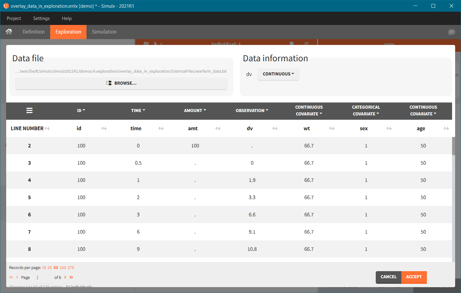 |
After tagging columns, click on the ACCEPT button to load the data file. Displayed observations can be filtered (green frame) using categorical covariates present and correctly tagged in the loaded file. In the figure below, ticked box next to a value “0” means that in the plot there are only observations for individuals with SEX = 0. To change the tagging, click on the VIEW/EDIT button (blue frame).
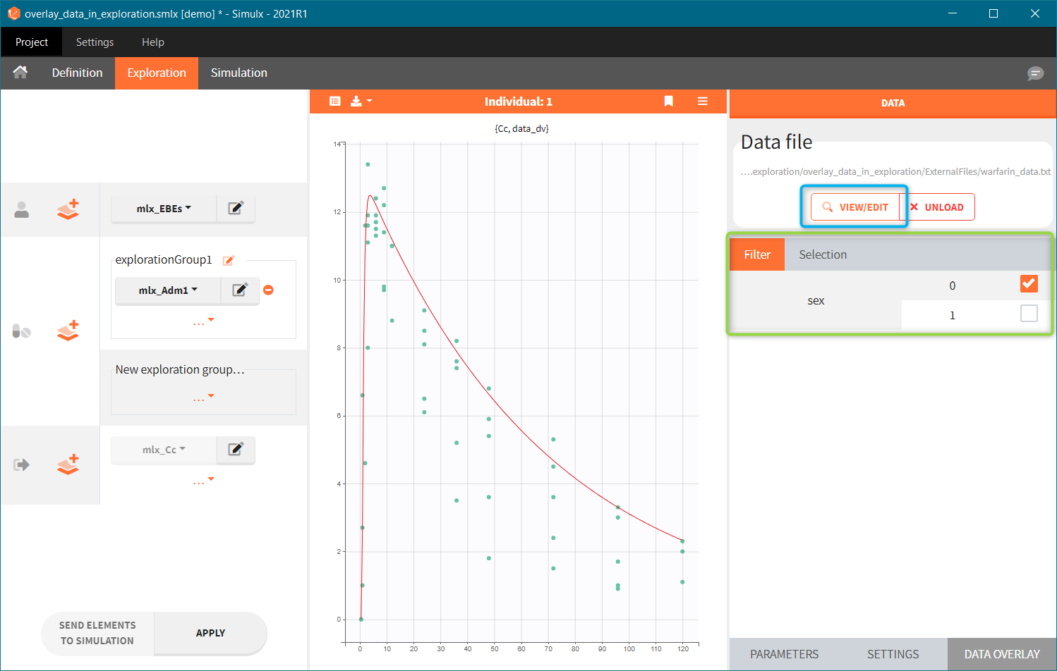
When a Simulx project is build by importing a Monolix project, then the dataset – used in the Monolix project – is set automatically in the DATA OVERLAY sub-tab.
Display
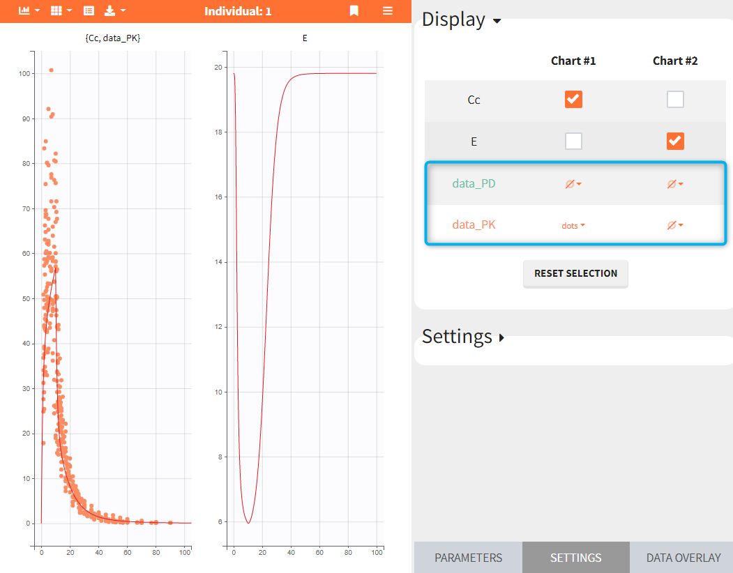
Observed data are displayed automatically as “dots” if there is only one output in the Exploration scenario and the data file contains only one observation type. Otherwise – in case of several different outputs or multiple observations types – data display has to be selected in the SETTINGS sub-tab.
In the data – charts grid, see the figure below, observation data are listed in rows. Numerical order is applied if the observation identifiers in the data file are integers, eg. data_1, data_2, …; or alphabetical order if the observation identifiers are strings, eg. data_PD, data_PD, as in the figure below. Charts are in columns. To display data on a chart, click on the drop-down menu of ![]() in the appropriate grid cell and select “dots” or “lines”.
in the appropriate grid cell and select “dots” or “lines”.
Link to individual selection
If any of the exploration scenario elements contains a table with several individuals, then the simulated individual can be selected in the PARAMETERS sub-tab, see individual prediction description section for details. To link the observed data to the selected individual, enable the toggle “Link to individual selection”. Only data corresponding to the selected individual will be displayed on charts. The option “Link to individual selection” only appears if the list of ids found in the data set and in the elements selected for the simulation are the same.
It is also possible to display one or several individuals selected from the dataset, which may or may not be linked to the simulated individual. This option is available in the DATA OVERLAY sub-tab, in the “Selection” section. In the example below, selection contains a range of IDs between 15 and 42 and only observed data corresponding to these individuals are overlaid on the chart.
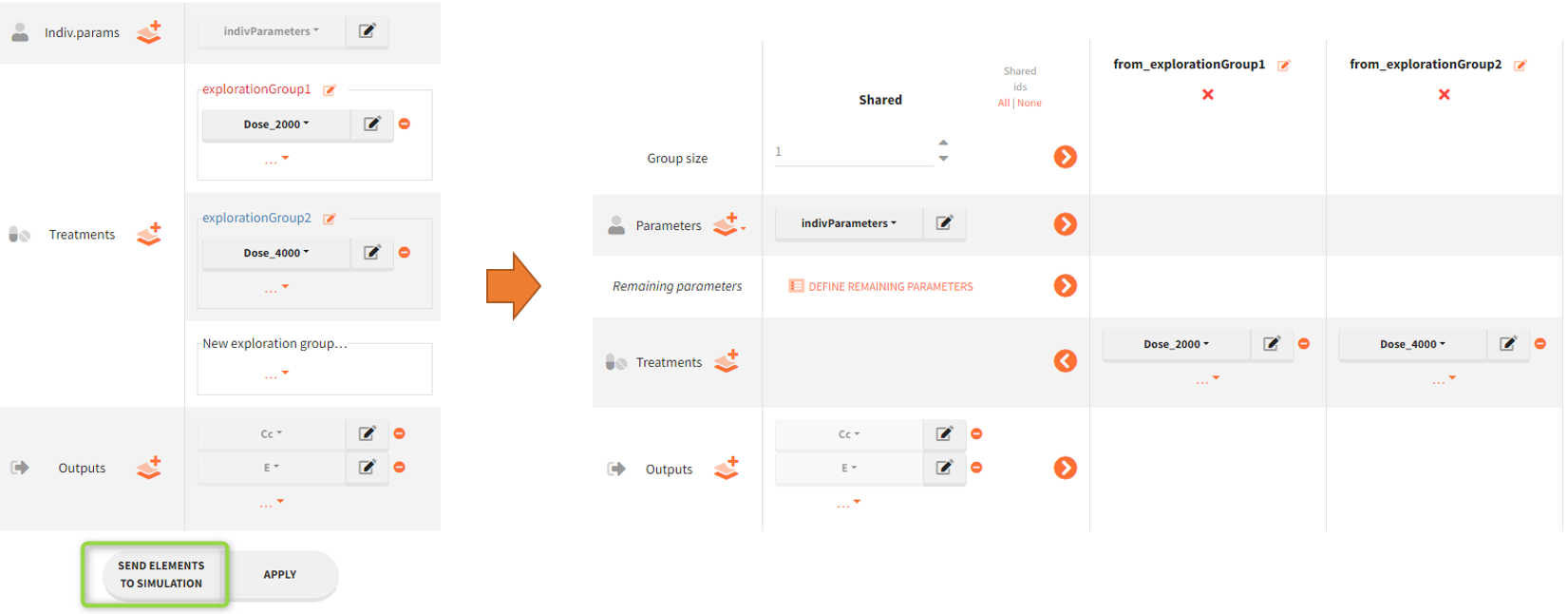
Sending elements to simulation
The button “Send elements to simulation” sends all elements selected in the Exploration to the scenario definition in the tab Simulation. Exploration groups are turned into simulation groups with a default size of 1 individual per group.
Plots settings
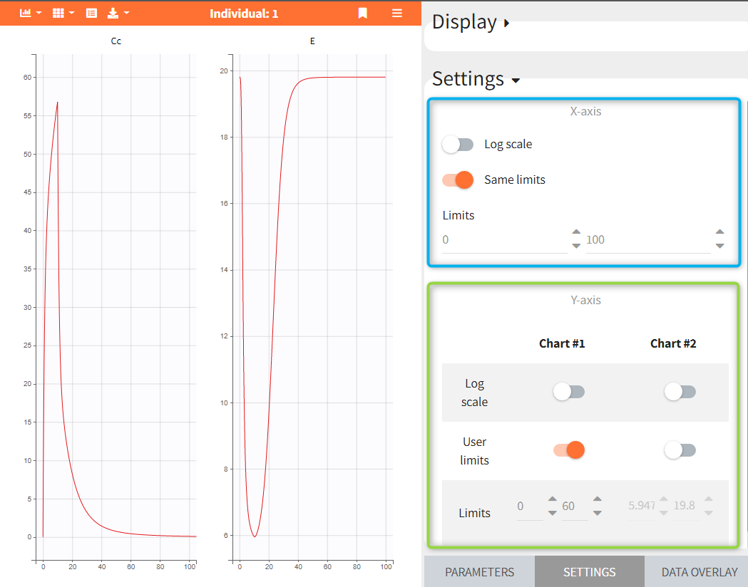
The panel “Settings” can be used to control plots features, such as the scale of the curves displayed on each plot and axis limits. The x-axis is common for all charts, while the y-axis can be specified independently for each chart.
In the following figure, two variables Cc and E are displayed on separate charts. They have the same x-axis limits – blue frame. The y-axis is specified for each chart: user limits 0-60 on the chart – 1, and automatic limits on the chart – 2 – green frame.
Exporting plots
The “export” button on top of the plots can be used to save the plots as an image in the result folder. Two image formats are available: PNG and SVG (Scalable Vector Graphics).
