Running the tasks in Simulx automatically generates interactive plots for simulation outputs, outcomes and endpoints. Interface provides many plots features such as:
- Different chart types depending on simulation outputs and post-processing methods: individual outputs or distributions.
- Plots settings: display, binning criteria, axes, visual cues.
- Stratification and customization options.
- Export:plots as images, charts data and charts settings.
To learn more about plots in the exploration tab, click here – it is a special documentation page for the model Exploration feature.
- The Plots tab
- Continuous data
- Individual output
- Output distribution
- Non-continuous data
- Time-to-event
- Discrete data
- Individual output
- Output distribution
- Outcomes and endpoints
- Numeric outcome distribution
- Binary outcome distribution
- Endpoints distribution
- Plots features
- Settings
- Stratify
- Preferences
The Plots tab
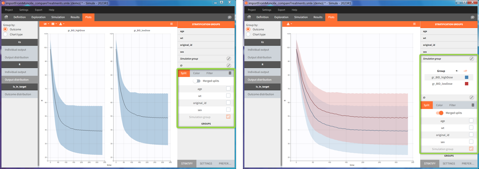
Plots tab structure and settings in Simulx is the same as in Monolix and Pkanalix. The left panel (green frame) contains the list of available plots grouped by outcome type or by chart type. Central region displays one selected plot, for instance output distribution of Cc. Each simulation group has its own subplot. On top of the plotting area, there are layout options and a button to export current plot as an image (blue frame). The right panel is for plots settings, such as display or axis options, definition of bins or visual cues. In addition, separate sub-tabs at the bottom of this panel (red frame) allow to stratify plots data and change preferences of the plotting area.
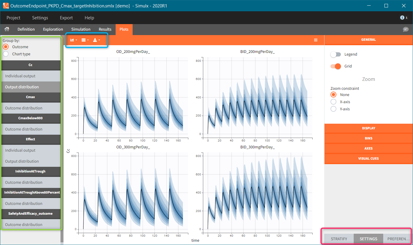
- Simulation outputs. Only output elements used in a simulation scenario generate plots. If more then one simulation output element uses the same model output, then all these simulation outputs are merged on one same plot. For instance, concentration during the whole treatment period on a fine grid and Ctrough on the last treatment day – both using model prediction Cc. Title name of the plot corresponds to the model output name.
- Outcomes. Outcomes of different endpoints have separate plots, for instance “Cmax” and “CmaxBelow800”. If there is more then one outcome in an endpoint, then a plot displays the combination of them. Moreover, it appears in the plots list as “<endpointName>_outcome”, for instance “SafetyAndEfficacy_outome”.
- Endpoints distribution is generated only for simulations with replicates.
Plots for continuous data
There are two types of plots for continuous outputs. Firstly, the individual output subplot, which contains individual curves. Secondly, the output distribution with the percentiles. Title of each outcome section in the plot list corresponds to the name of a model variable, for instance Cc for model predictions or y1 for model observations. It is not the name of the output element selected in the simulation tab.
Individual output
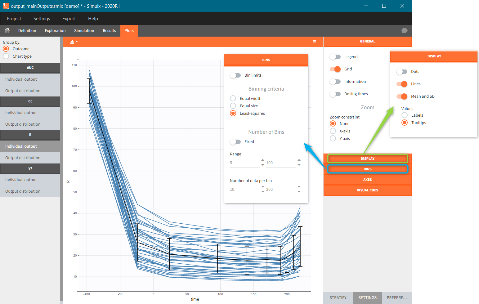
Individual output plots represent individual curves computed for each id and each occasion (if present in the model). It is possible to DISPLAY lines, dots and median with standard deviations (green frame), or a combination of them. The statistics (median and standard deviations) use the binning options available in the BINS section of the settings (blue frame). If simulation uses replicates, then by default a plot shows only one replicate. However, you can select other replicates – one or several – in the DISPLAY sub-tab.
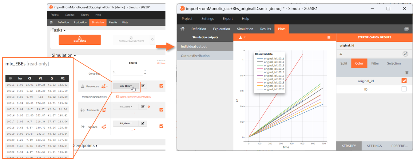
The ID used in plots stratification is the simulated ID, which is the id column in the result tables. ID i is the i-st parameter set sampled for simulation.
Since the version 2023R1, if a simulation uses elements with custom id lists, for example a table of individual treatments, or a table of individual parameters, the original ids in these tables are available to stratify the plots. For example in the demo project “importFromMonolix_useEBEs_originalID.smlx”, we use the element mlx_EBEs which is a table of individual parameters. The original IDs used in this table can be used to color or split the individual output trajectories.
Output distribution
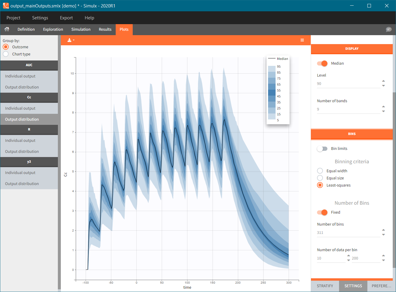
Output distribution plots show percentiles of the simulated data for all ids and all replicates computed. The BINS section of the settings contains the binning options. DISPLAY settings allow to change plot features, such as median, number of percentiles bands and levels.
When the “Output distribution” plot is split (by simulation group or by a covariate), it is possible to overlay the prediction intervals on a single plot with different colors using the “merged splits” toggle. You can choose the colors in the “stratification groups”. This feature is available starting from the Simulx 2023 version.
Plots for non-continuous data
Time-to-event
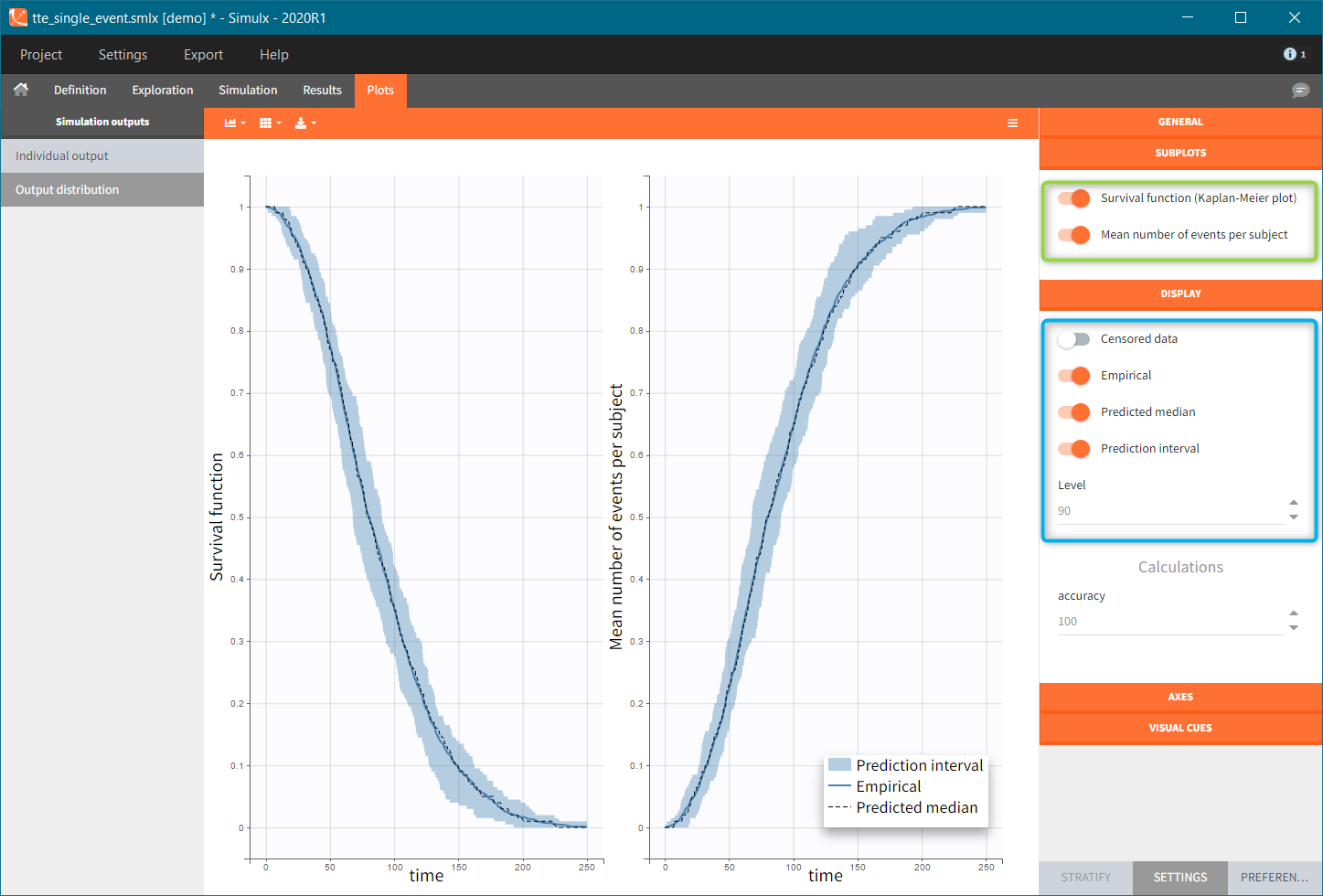
Individual output of time-to-event data is a single Kaplan-Meier curve – estimator of the survival function. In addition, for simulations with replicates, the Kaplan-Meier curves for each replicate are interpolated on one grid and displayed as a prediction interval at a specific level (blue frame). Mean number of subjects plot is available in the SUBPLOTS section (green frame). Click here for more information about time-to-event data plots.
Discrete data (categorical and count)
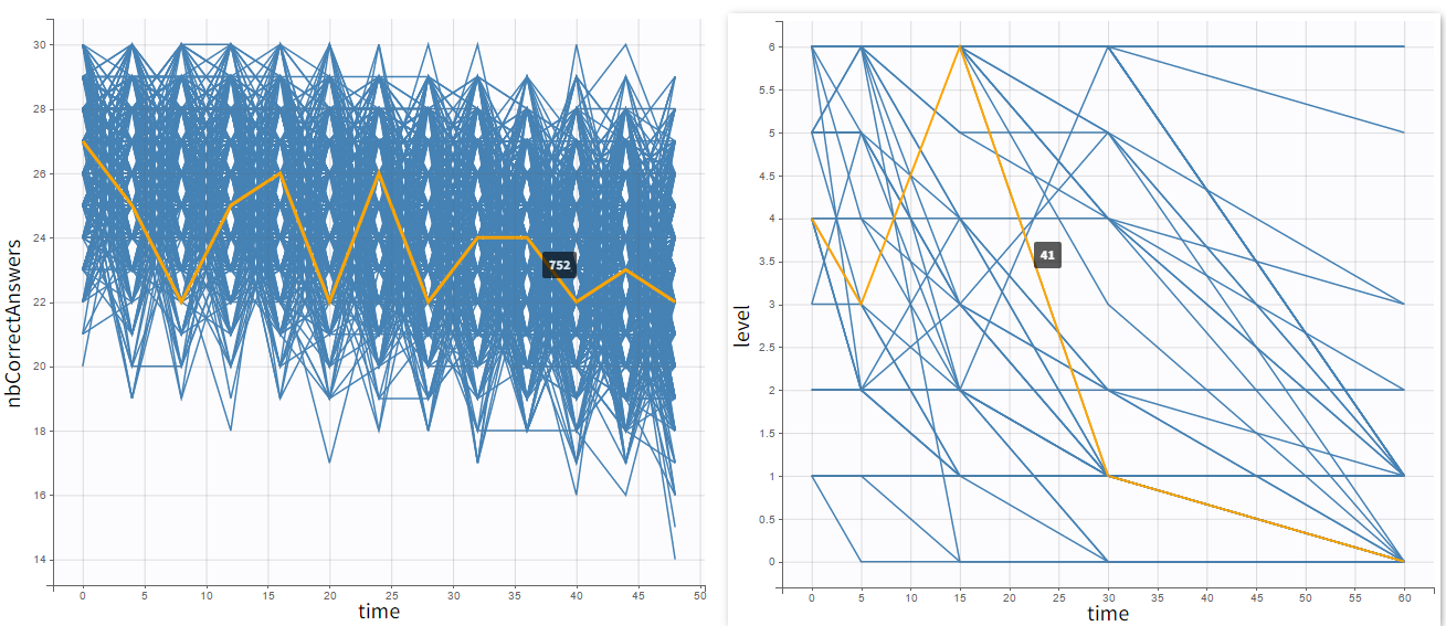
Individual outputs are functions of time for each individual and occasion.
- Count data: plots show the number of observed events in a specific period, for instance “number of good answers” (on the left).
- Categorical data: plots show nominal categories, for instance “respiratory status level” (on the right).
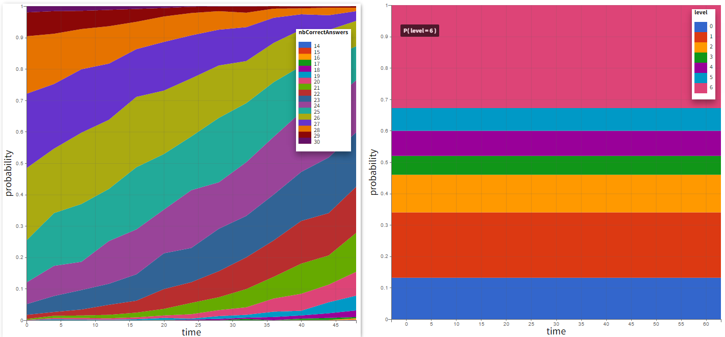
Output distribution shows the time evolution of probabilities of different categories. In case of count data, each number of “counts” constitutes a separate category.
Plots for outcomes and endpoints
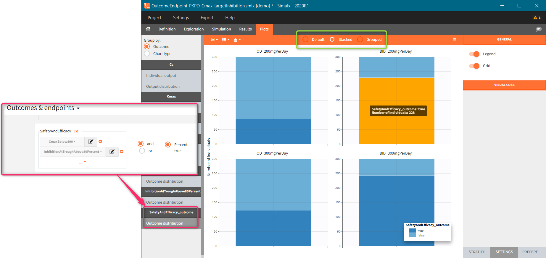
- Outcomes represent a post-processing of the simulation outputs done for each individual, so plots display their distribution within a population. Simulx displays only outcomes used in endpoints (Outcome&endpoint section in the simulation tab). If there are several outcomes in one endpoint, then the outcome distribution corresponds to of a combination of these outcomes, and not to separate outcomes.
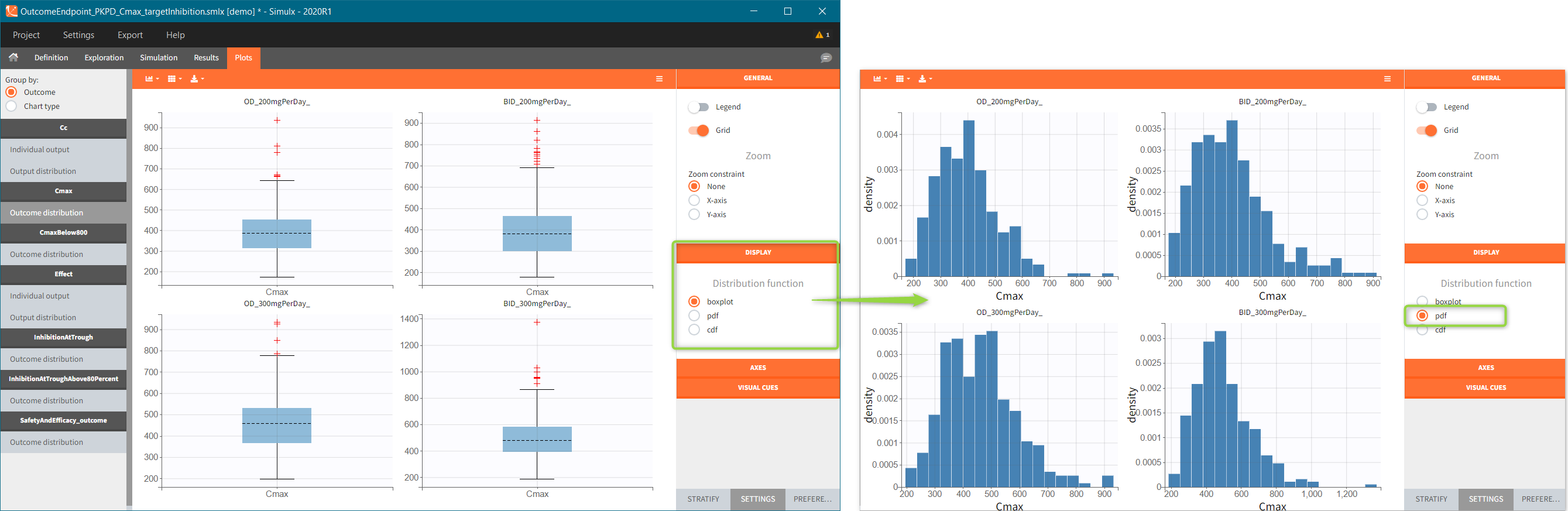
- Depending on a type of an outcome, plots are histograms or box plots for numeric outcomes, and stacked histograms for binary outcomes.
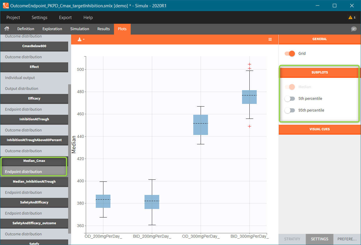
- Endpoints summarize the outcome values over all individuals. In simulation with replicates, Simulx displays them as box plots.
- In all boxplots, the dashed line represents the median, the blue box represents the 25th and 75th percentiles (Q1 and Q3), and
the whiskers extend to the most extreme data points, outliers excluded. Outliers are the points larger than Q1 + w*(Q3 – Q1) or smaller than Q1 – w*(Q3 – Q1) with w=1.5. Outliers are shown with red crosses.
[Demo: 6.1.outcome_endpoint/OutcomeEndpoint_PKPD_Cmax_targetinhibition]
Numeric outcome distribution:
“Cmax” outcome gives for each individual the maximum of the output element “Plasma concentration”. In this case, the outcome distribution can be a box-plot or as a histogram (selection in the DISPLAY settings). Each group is on a separate subplot. This outcome is the only outcome in the endpoint, so the title name of the plot in the list coincides with the outcome name.
Binary outcome distribution
“CmaxBelow800” outcome is a of boolean type (true/false) and compares the maximal value of the “Plasma concentration” with a threshold of 800. If Cmax is below this value, then the outcome is true, otherwise it is false. Similarly, “inhibitionAtTroughAbove80Percent” outcome compares the average of the values in the output element “TargetInhibition_at168h” with a threshold of 0.8 (i.e 80%). These two outcomes belong to one endpoint “SafetyAndEfficacy”, so the plot shows the distribution of true/false values corresponding to the combination of the two conditions. In this case, the title name of the outcome plot is the name of the endpoint “_outcome” (red frame). Binary outcomes use stacked or grouped histograms (green frame). Hovering on a any part of the histogram highlights it, shows the outcome value and the corresponding number of individuals.
Endpoint distribution
If this simulation scenario is run several times – option “replicates” available in the Simulation section – then the endpoint distribution plots are added to the plots list. Endpoint median_Cmax is a a box-plot with median value and standard errors for groups listed on the x-axis. For endpoints using numerical outcomes, uncertainty of the 5th and 95th percentiles can be added from the settings – SUBPLOTS section (green frame).
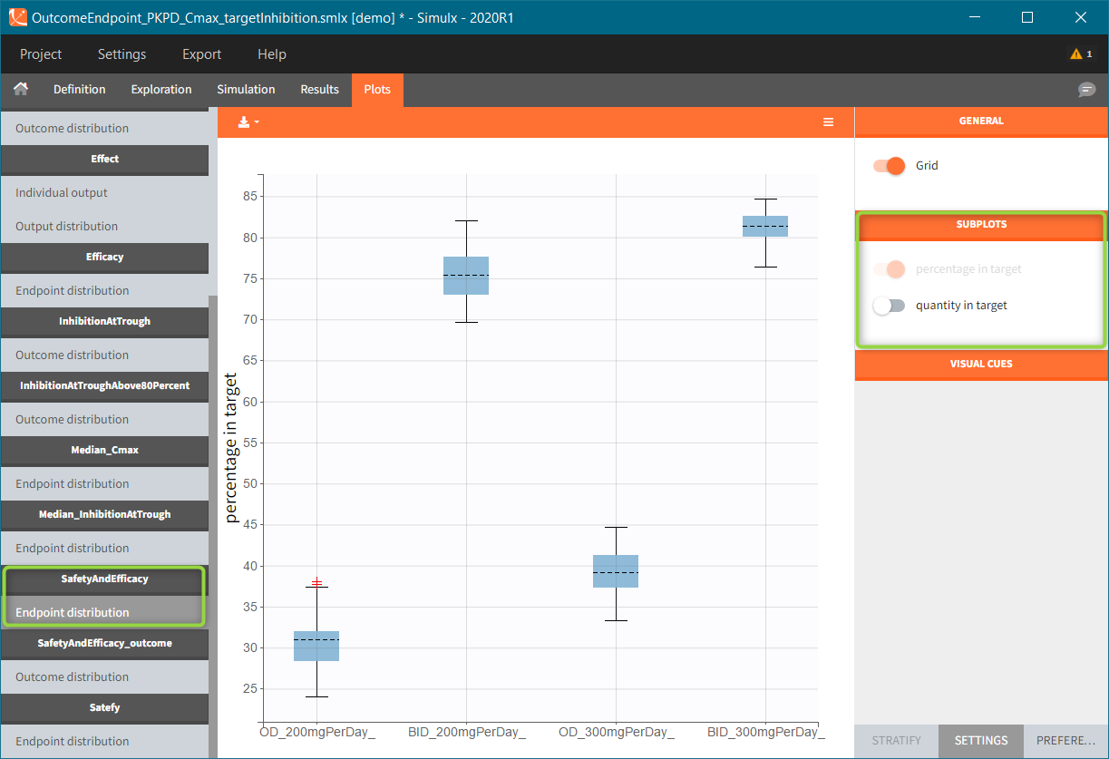
Endpoints using binary outcomes, in this example the SafetyAndEfficacy endpoint, calculate the percentage of individuals with “true” outcomes values. As previously, the endpoint distribution is a box-plots with different groups on the x-axis. A subplot with the number of individuals is available from the settings.
Plots features
The right panel of the Plots tab has several sub-tabs – at the bottom of the interface window – to interact and customize the charts:
- “Settings” modify plots elements, such as: hide or display additional data, adjust binning criteria, change axis or add visual cues
- “Stratify” splits, filters or colors data points using covariates.
- “Preferences” customize graphical aspects of plots such as colors, font sizes, line width or margins.
Icons at the left-top angle of the plotting area – ![]() – allow to select sub-plots for visualization, change the sub-plots layout and export the plots as a png or svg file (saved in the Chart folder in the Results). In addition, using the “Export” in the top menu saves all generated plots (Export plots), saves all data used to generate plots as txt files to re-plot them outside Simulx ( Export charts data, see here for more information) and save charts settings so that the selected customization is applied to all Simulx projects (Export charts settings as default).
– allow to select sub-plots for visualization, change the sub-plots layout and export the plots as a png or svg file (saved in the Chart folder in the Results). In addition, using the “Export” in the top menu saves all generated plots (Export plots), saves all data used to generate plots as txt files to re-plot them outside Simulx ( Export charts data, see here for more information) and save charts settings so that the selected customization is applied to all Simulx projects (Export charts settings as default).
Simulx has the same architecture of plots features, preferences and export options as Monolix. Here is an extensive documentation about it, with links to Features of the week videos that explain how to use customization in MonolixSuite applications.
Settings
Settings sub tab has several sections, which may differ between plot.
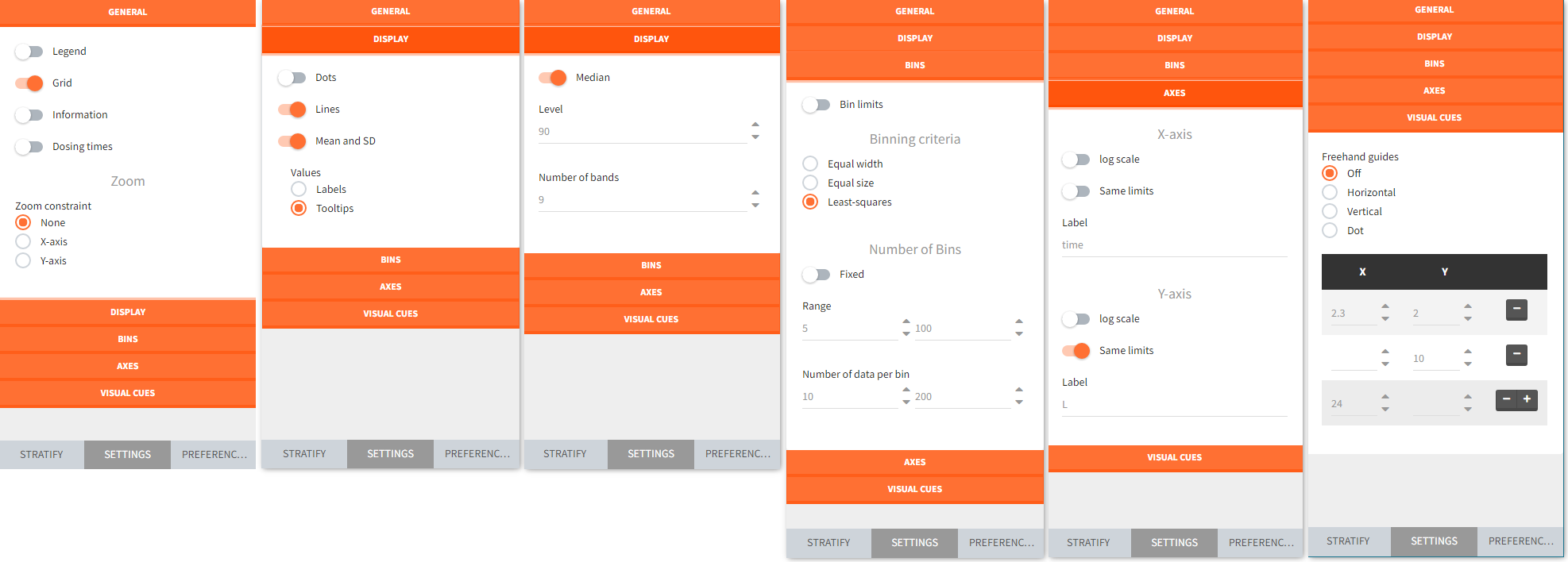
- General settings include toggle buttons add legend, data information, dosing etc. Zoom is interactive by selecting with a cursor a region directly on a plot.
- Display section for “individual output” plots has toggle buttons to add lines, data dots and Mean and SD (at least one option needs to be selected). For “output distribution” it customizes the level of percentiles and the number of bands shown.
- Bins serve to specify the criteria for computing the mean&SD for the “individual outputs” and percentiles for the “output distribution”. There are several strategies to segment the data: equal width, equal size and the least squares criterion. In addition, number of bins, range and number of data per bin are changeable.
- Axes is for general X and Y axis settings, such as log scale, same limits across plots and main axis titles.
- Visual cues freehand guides option allow to place additional lines or points on plots directly with a cursor. Definition of a specific location is via (X,Y) coordinates – one entry filled gives a line, two filled entries specify a point.
Stratify
Stratification panel contains a list of covariates that can split, color or filter the data. Simulx automatically allocates covariates in groups – according to modalities for categorical covariates and in two “equal count” groups for continuos covariates. As a result stratification is immediately applied after ticking appropriate boxes.
Example:
- Color data according to two weight groups (blue frame)
- Split data between HV (healthy volunteers) and RA (rheumatoid arthritis) patients (green frame)
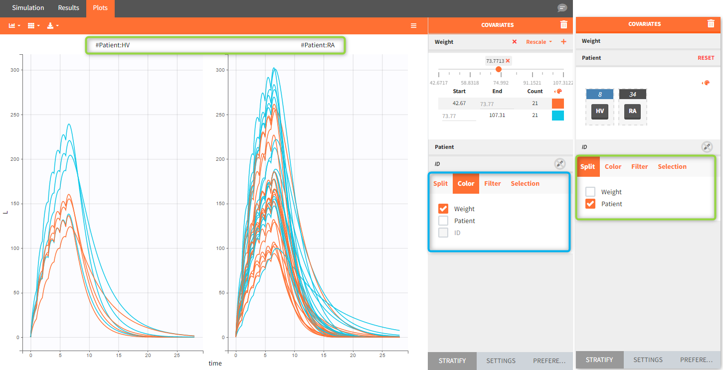
When the “Output distribution” plot is split (by simulation group or by a covariate), it is possible to overlay the prediction intervals on a single plot with different colors using the “merged splits” toggle. The colors can be chosen in the “stratification groups”. This feature is available starting from the 2023 version.
